You export a logo, the brand red looks right on your laptop, and
then a colleague opens the same file on a different machine and the
red has gone slightly orange, or slightly muddy. Nobody touched the
file. The pixels are identical. What changed is the chain of
assumptions sitting between the stored numbers and the light that
reaches an eye. Web colour management is the practice of making that
chain explicit instead of hoping it works out.
This is a guide to the parts that matter on the web: what a colour
space actually is, why sRGB became the safe default, what changes
when a screen can show more colours than sRGB can describe, and the
small set of CSS and file-tagging habits that keep colour stable
across all of it.
What a colour space is
A pixel is a few numbers — for an 8-bit RGB image, three values
from 0 to 255. On their own those numbers mean nothing. 255 0 0 is
not “red”; it is an instruction whose meaning depends on a rulebook.
A colour space is that rulebook. It pins down three things: which
exact red, green, and blue the channels refer to (the primaries),
what counts as white (the white point), and how the stored numbers
map onto light intensity (the transfer function, often loosely
called gamma).
Change the rulebook and the same numbers produce different light.
The set of all colours a given rulebook can describe is its gamut.
A wider gamut reaches more saturated colours — deeper reds, greener
greens — that a narrower one simply cannot name. The MDN glossary
frames a colour space as exactly this: a model plus the mapping that
gives its numbers a physical meaning.
The whole problem of colour management reduces to one rule: a set of
numbers must always travel with the rulebook it was authored under,
or be converted honestly when it moves to a different one. Lose the
rulebook and a renderer has to guess.
sRGB, the default that held for two decades
sRGB was standardised in the late 1990s as a common space for
monitors, the web, and consumer cameras. Its gamut is modest by
modern standards, but that was the point: it described what a typical
CRT could actually show, so a colour that existed in an sRGB file
could be reproduced on ordinary hardware without anyone managing
anything.
Because of that, the web grew up treating sRGB as the implicit
rulebook for everything. A CSS #ff0000, an untagged JPEG, a
<canvas> — all assumed sRGB unless told otherwise. The CSS Color 4
specification still describes legacy colour syntax as operating in an
implicit sRGB space, and most older content depends on that
assumption holding. For a long time it did, because almost every
screen was an sRGB screen, give or take. The mismatch between “what
the file says” and “what the panel can show” was small enough to
ignore.
Wide gamut arrives: Display-P3
That assumption broke when screens got better. Most current phones,
laptops, and good external monitors now cover a wider gamut than
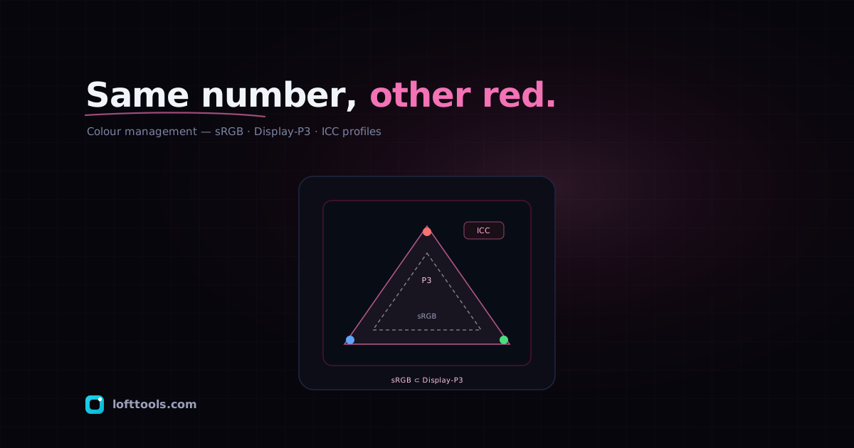
sRGB. On the web the relevant target is Display-P3, the space
Apple defined by combining the DCI-P3 cinema primaries with the
familiar D65 white point and the sRGB transfer curve. Its gamut is
roughly 50% larger than sRGB, with noticeably more reach in
saturated reds and greens, as web.dev’s colour-spaces write-up notes.
The catch is that you cannot reach those extra colours through the
old sRGB-only syntax, because sRGB has no numbers for them. A colour
outside its gamut is unnameable, not merely dim. To use the wider
range you need both a way to specify colours in P3 and a way to
ask whether the current display can actually show them. CSS now has
both.
Telling the browser which rulebook: ICC profiles and tagging
For images, the rulebook usually travels as an embedded ICC
profile — a small block of data inside the file that says, in
effect, “interpret these pixels using this colour space.” A
correctly tagged P3 photograph carries its P3 profile, and a
colour-managed browser reads that profile, then converts the colours
to whatever the display needs.
The failure mode is what happens when the tag is missing. WebKit’s
Improving Color on the Web explains its rule plainly: an untagged
image is assumed to be sRGB, so that colours in the image match the
CSS colours on the page. That default is sensible, and it is also a
trap. If you author or export a photograph in Display-P3 and then
strip the profile — which plenty of “optimisation” pipelines do to
save a few bytes — the file still contains P3 numbers, but every
renderer now reads them as sRGB numbers.
The result is a specific, recognisable kind of wrong. The saturated
P3 values get squeezed into the smaller sRGB interpretation, and the
image comes out desaturated and slightly off-hue — vivid reds turn
flat, skin tones go sallow. It looks like a dull photo rather than a
broken one, which is exactly why it slips through review. The fix is
not to re-edit the image; it is to stop discarding the profile. If
your build tooling strips ICC data, either keep the profile or
genuinely convert the pixels to sRGB so the numbers and the rulebook
agree again. Stripping a P3 profile is not the same as converting to
sRGB, and conflating the two is the most common way colour breaks in
practice.
One corollary worth holding onto: an embedded profile is the only
honest record of intent. Once it is gone, no later step can recover
which rulebook the numbers belonged to. It can only guess, and the
guess is sRGB.
Three features cover most of what you need, and all three now work
across the major engines.
The color() function specifies a colour inside an explicit
colour space rather than the implicit sRGB one. Per CSS Color 4 and
MDN, it takes a colour-space identifier — srgb, display-p3,
rec2020, and others — followed by the channel values, with an
optional alpha after a slash:
.brand {
  color: color(display-p3 1 0.5 0);
  color: color(display-p3 1 0.5 0 / 0.5); /* with alpha */
}
The color-gamut media feature asks what the display can
actually reproduce. MDN gives three values: srgb covers the vast
majority of colour displays; p3 means a gamut at least as wide as
Display-P3, which includes and exceeds sRGB; rec2020 means wider
still, including and exceeding P3. They nest, sRGB inside P3 inside
Rec2020. The standard pattern is to author a safe sRGB colour, then
override it only where the hardware can do better:
.vibrant { background-color: color(srgb 0 0 1); }

@media (color-gamut: p3) {
  .vibrant { background-color: color(display-p3 0 0 1); }
}
WebKit’s Display-P3 article pairs this with @supports (color: color(display-p3 1 1 1)) when you also want to confirm the browser
understands the syntax, separate from what the panel can show.
The dynamic-range media feature reports whether the display
offers high brightness and contrast, with values standard and
high. It answers a different question from color-gamut — head-
room rather than gamut — so it is the right gate for genuinely HDR
treatments, as web.dev’s media-features guide describes:
@media (dynamic-range: high) {
  .neon { color: color(display-p3 1 0 0); }
}
Practical advice for delivering correct colour
A few habits cover most cases.
Author and store images in a known space, and keep the ICC profile
embedded. The bytes a profile costs are trivial next to the cost of
shipping desaturated photos. If you must drop the profile, convert
the pixels to sRGB first — never strip alone.
Treat sRGB as the floor, not a compromise. Write your base colours
in sRGB so every screen renders the intended thing, then layer P3
through @media (color-gamut: p3) as an enhancement. A viewer on an
sRGB panel should never see a broken page because a value lived
outside their gamut; progressive enhancement makes that
impossible by construction.
Check @supports separately from color-gamut. Syntax support and
hardware capability are different facts, and on rare configurations
they diverge. Gate on whichever one your effect actually depends on.
Test on a real wide-gamut screen. A subtle P3-versus-sRGB shift is
nearly impossible to judge from a description or a screenshot that
has itself been colour-converted somewhere in the pipeline.
None of this requires deep colour science. It requires one discipline,
applied consistently: never let the numbers and their rulebook drift
apart. Tag your images, declare your colour spaces, gate the wide-
gamut versions behind a query that confirms the screen can show them,
and the brand red stops depending on whose laptop happens to open the
file.